INTRODUCING ‘SHADES OF FLAT AND LUSTRE FINISHES’
A HARPER’S BAZAAR X STUDIO SPELLING COLLABORATION
There are some things in the visual world I love so much that I feel a kind of ache when I look at them. The main one for me is the moment in the 1930s when European Surrealism crossed over to the mainstream, in particular into American graphic design, and the strange, dreamlike work of the Surrealists entered the world of lipstick adverts, magazine covers, page layout and typography.
The thing I love so much about this period in design is the atmosphere that springs up when shameless beauty meets unnerving strangeness meets functional design. It feels bold and new and disorientating, and it’s delivered in a way which is straight forward and uncomplicated, which makes it incredibly open-ended and playful. It doesn’t try to tell you what to think but instead it invites your own imagination to take flight, and it’s odd, sometimes very odd, and so exciting to look at. Most of all, I love that it’s knitted into everyday life, not the austere space of the gallery or museum. You see it when you least expect to and this is my favourite way of looking at things.
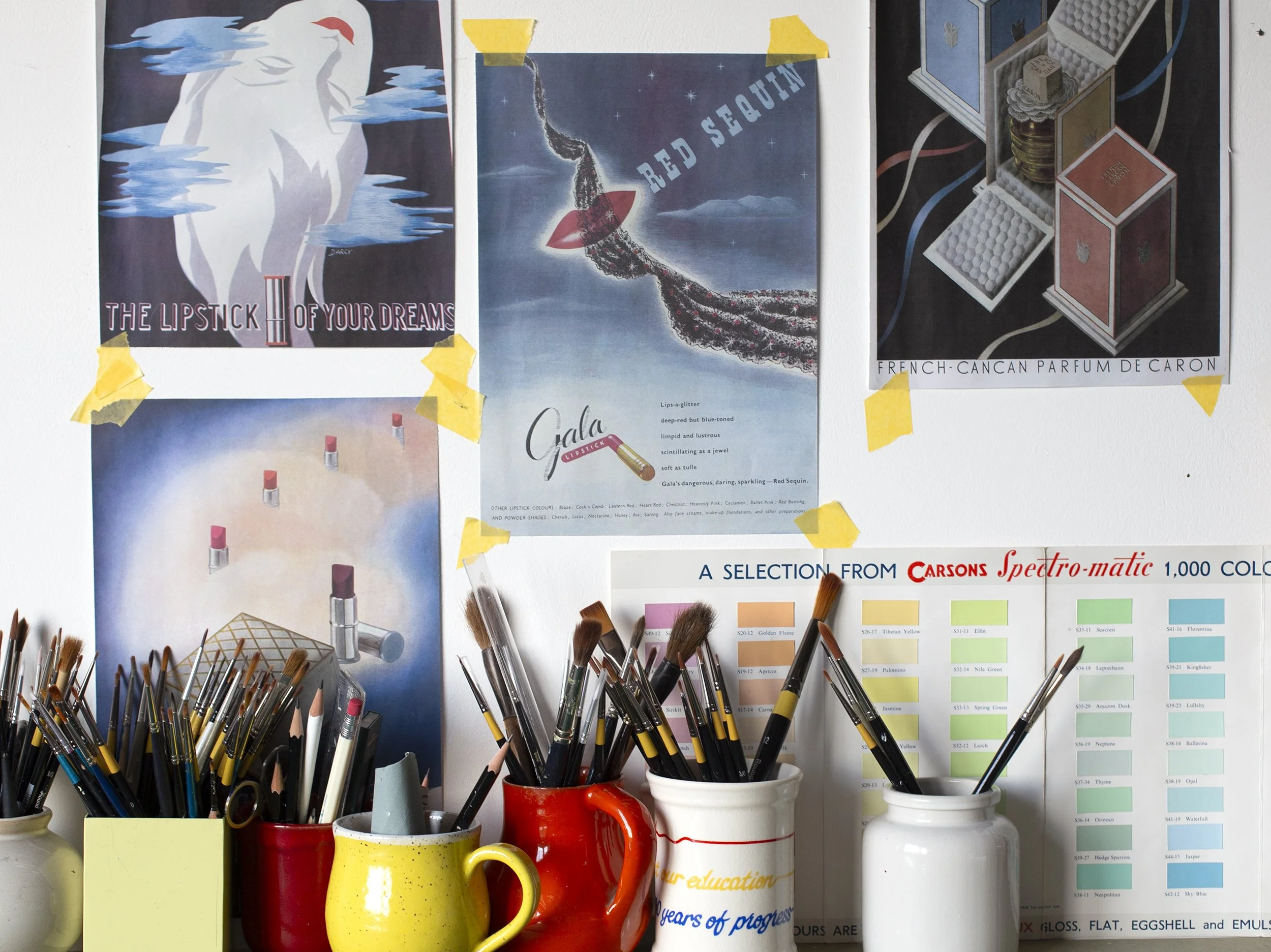
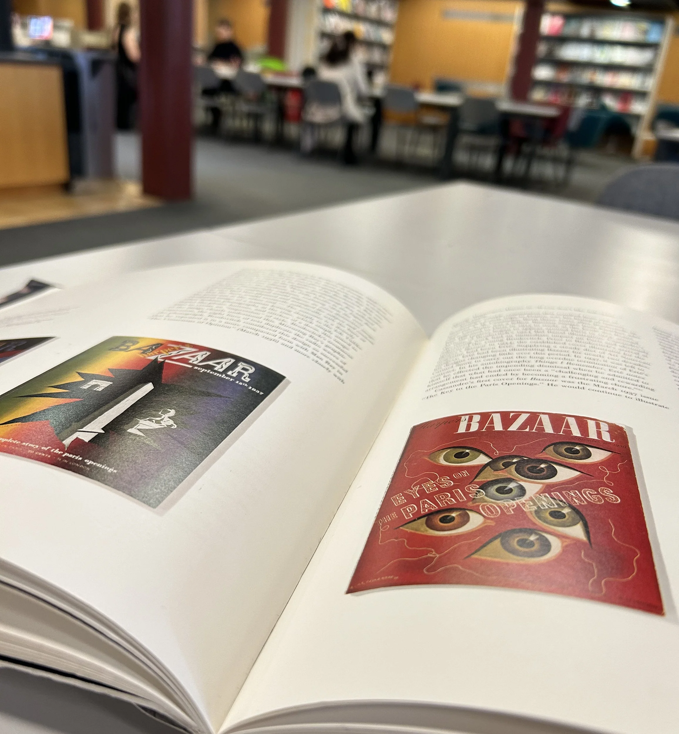
When I was painting The Cure for Dismal Surroundings back in 2024, my first 1930s paint chart, I started to research the work of Alexey Brodovitch, the legendary art director of Harper’s Bazaar between 1934 and 1958. Brodovitch was a creative genius who transformed 20th century traditions of visual storytelling. His influence on graphic design is to be found everywhere today, but in his time his dynamic use of diagonals, playful typography and abundant white space on the pages of Harper’s Bazaar were radically new ideas which defied all design conventions. His pages were full of movement; he was said to be ‘the man who made the pages dance’. He invited the Surrealists to contribute to the magazine and the issues of the 1930s, 40s and 50s are full of incredible work by artists such as Man Ray, Salvador Dali and Erwin Blumenfeld. I find this era incredibly inspiring. The day I first discovered his work in the library I took a photo, and I’m really glad I did. It’s dated February 1st 2024 and it marks the beginning of my love affair with his work!
I’m explaining all of this so that I can properly communicate the joy that I felt in 2025 when Hearst UK, the publisher of Harper’s Bazaar, got in touch to suggest a collaboration. I read the message, looked up at my studio wall full of surrealist Harper’s Bazaar covers, and felt my heart skip a beat.
What followed was a series of exciting meetings, exchanges of ideas and a huge amount of openness, generosity and support from Harper’s Bazaar, including unlimited access to their extraordinary archive, all of which has resulted in the collaboration we’re announcing now. Here we go!
SHADES OF FLAT AND LUSTRE FINISHES
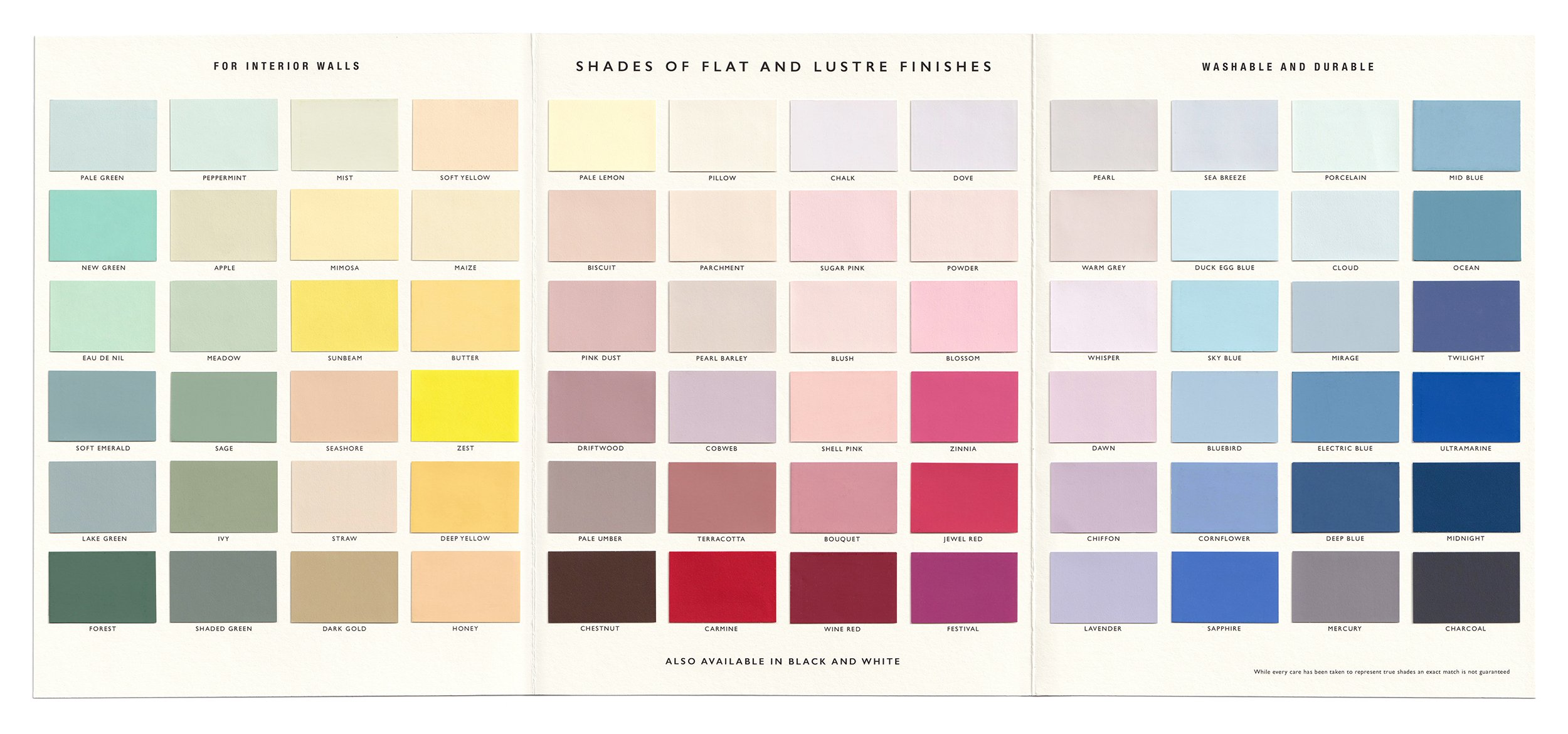
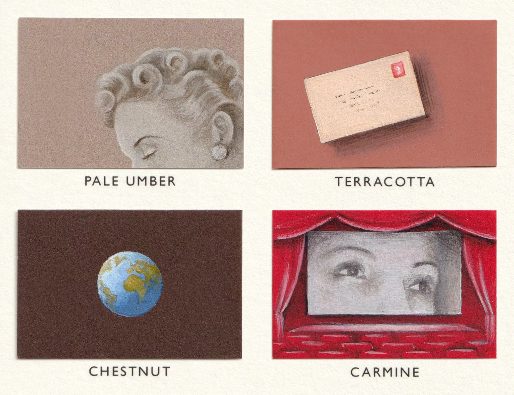
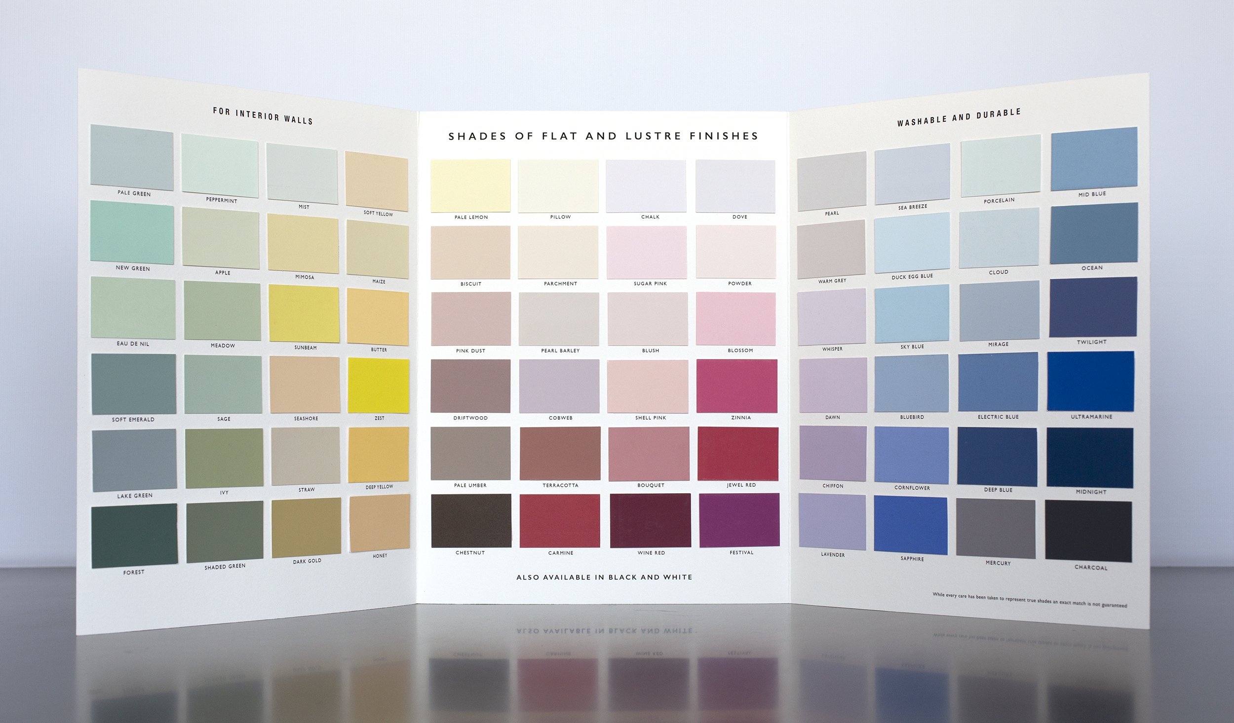
‘Shades of Flat and Lustre Finishes’ is a fictional vintage paint chart which I’ve made from scratch, with colours I’ve named myself. It has 72 colours and it’s a triptych; I’ve painted the chart in three stages, inspired by the Harper’s Bazaar archive, and each section of 24 paintings will be revealed over three issues of the magazine.
Here is the first section, which was in the September issue:
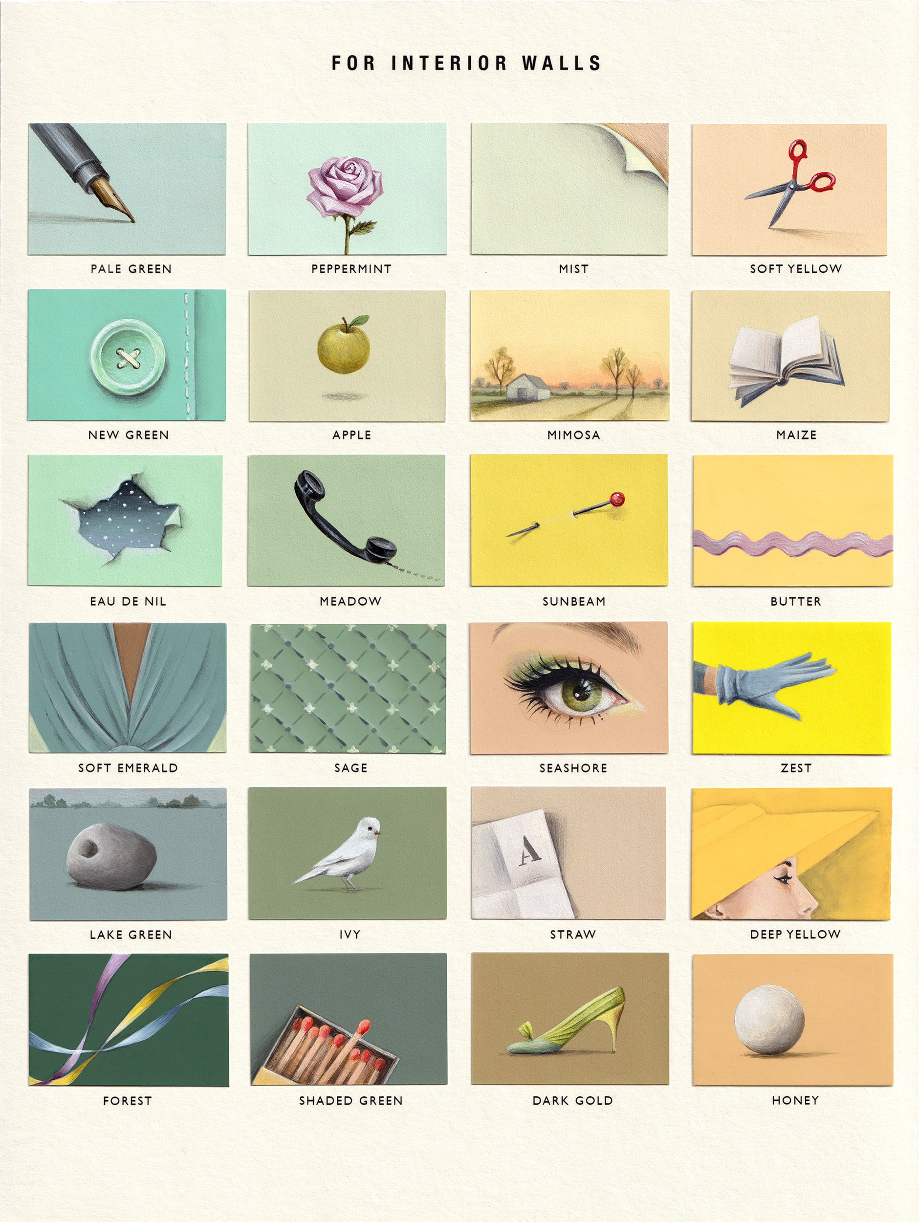
The first painting is a pen because I’m telling a story. Starting with tiny details that I’ve found on the pages of the magazine from across the decades I’m building up a picture of the disjointed thoughts, dreams and memories of the beautifully dressed women. I’m painting their silent internal world. There’s beauty and glamour alongside sadness, longing and unease - why the sharp pin, why the box of matches? Gradually stories will unfold, clues will come and go. A small white bird, a lonely public sculpture in a park at dusk, a bright green button, a phone call. Who is the lady in the yellow hat looking at? Is the elegantly gloved hand reaching out to someone? Why the letter A on a folded piece of paper? Keep an eye on the book. Keep an eye on the ribbons.
Here is the second section, revealed in the October issue of the magazine which has just hit the UK newsstands:

And this is how the two sections fit together:
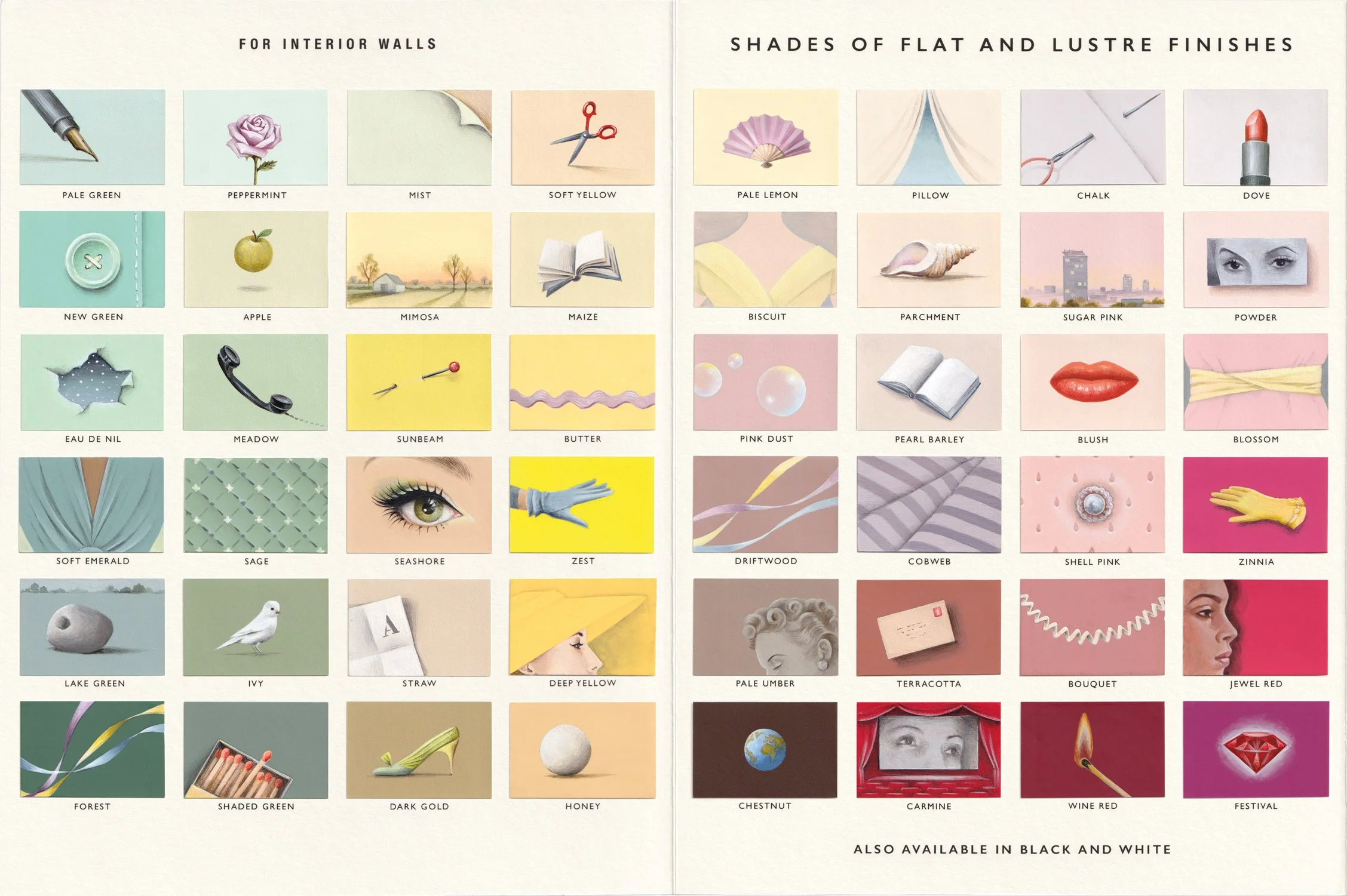
If you look at the join between the two you can see one of the diagonals that I’m building up across the chart, from the shoe on Dark Gold up to the book on Pearl Barley. I studied the diagonals of Alexey Brodovitch and I love how they guide your eye across the page, leading you this way or that. There are many more of these diagonals in the piece.
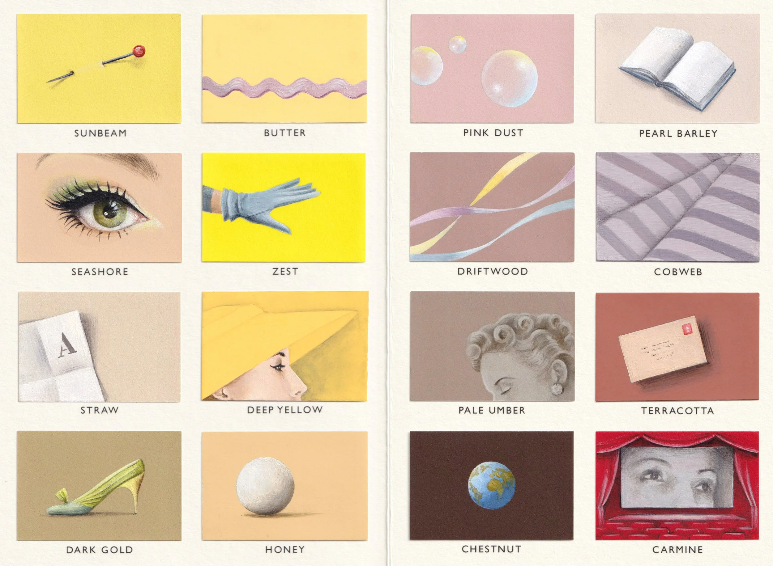
Weaving between these diagonals are the eyelines of the women, looking out from the pages of the magazine. Where are they looking? What are they looking for? I’m painting flashes of connection as their lives, thoughts, dreams, memories and plans crisscross and overlap.
There’s just one section left - the night-time colours - and this will be revealed in the November art issue, which will be on the newsstands on October 8th.
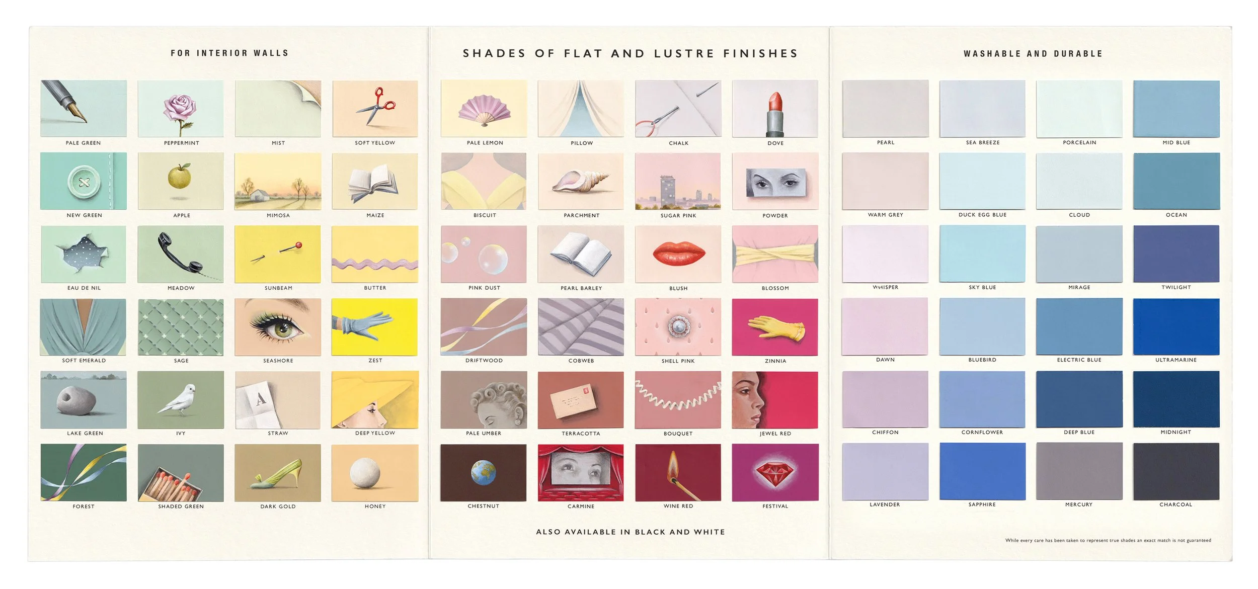
At that point there will be 300 beautiful limited edition prints of Shades of Flat and Lustre Finishes available for sale. This will be my first ever limited edition print and my first ever print collaboration. The prints will be £300, they will be signed and numbered and on general release from October 8th, and they will be available worldwide. There will be a presale window on October 7th. You can sign up here to be notified about this by Harper’s Bazaar:
If you’re on my mailing list you will also be sent the link the moment the prints go on sale. You can join my mailing list here:
I’ve been totally absorbed in this piece all year and I’m not sure I’ve ever worked so hard. I can feel that the work has taken a leap forward and my head is brimming with ideas and images which will fuel me for a long time to come. I’ve had Alexey Brodovitch at the back of my mind the whole time I’ve been painting; the diagonals, the sense of movement and the odd, surrealist juxtapositions are a tribute to him and his era. It’s been a wonderful experience from beginning to end.
Here is the article by Charlotte Brook which is in the September issue of Harper’s Bazaar UK, currently on the newsstands.
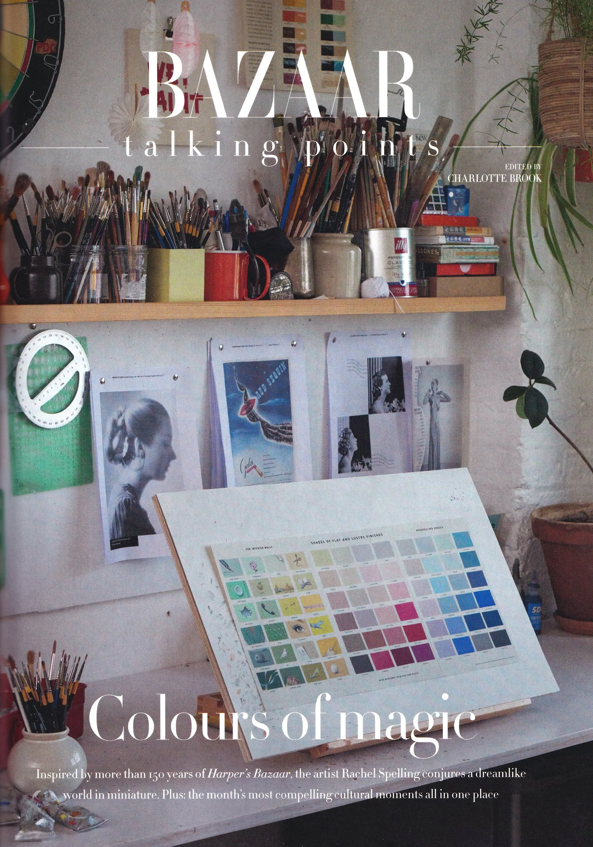
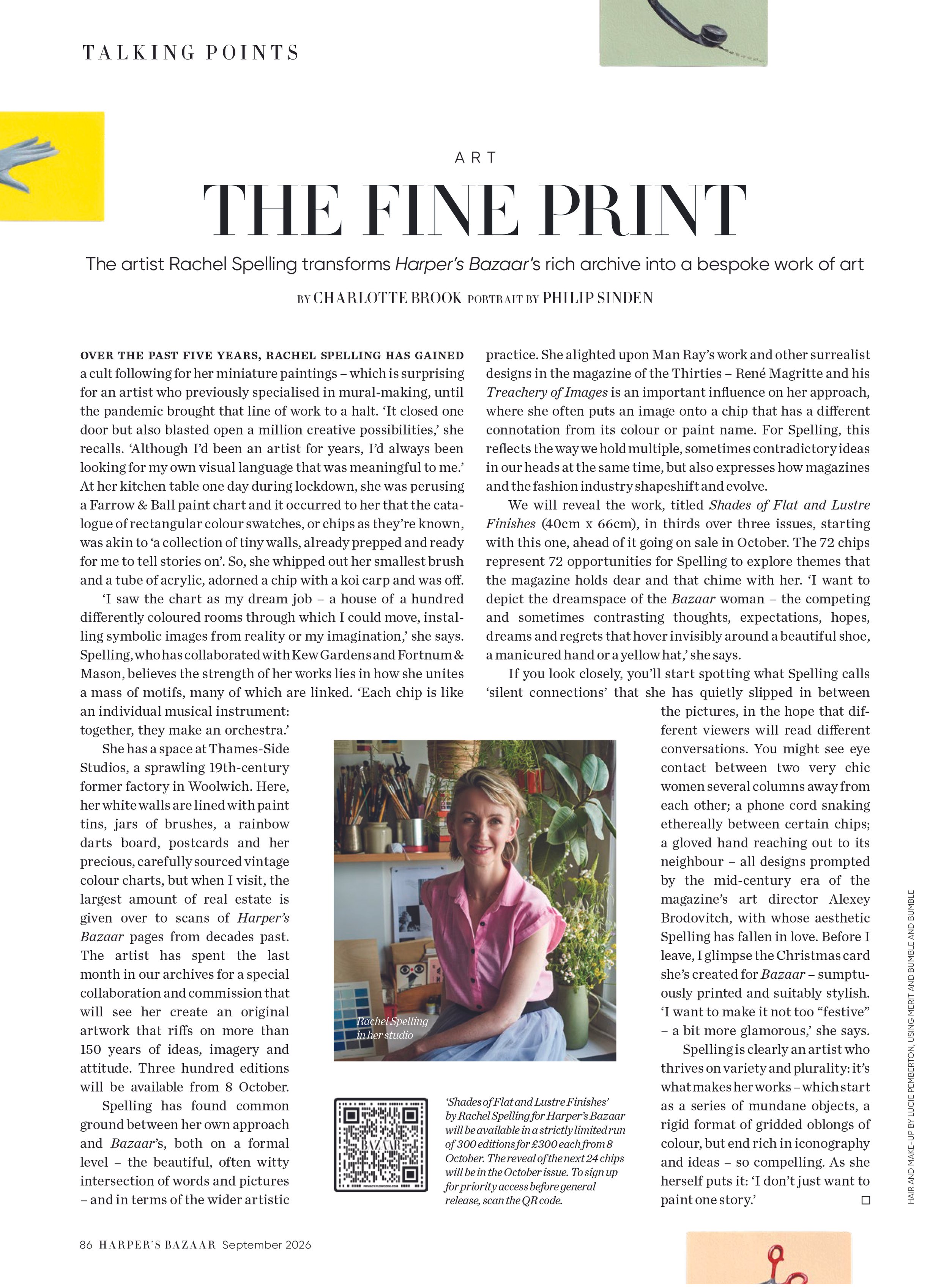
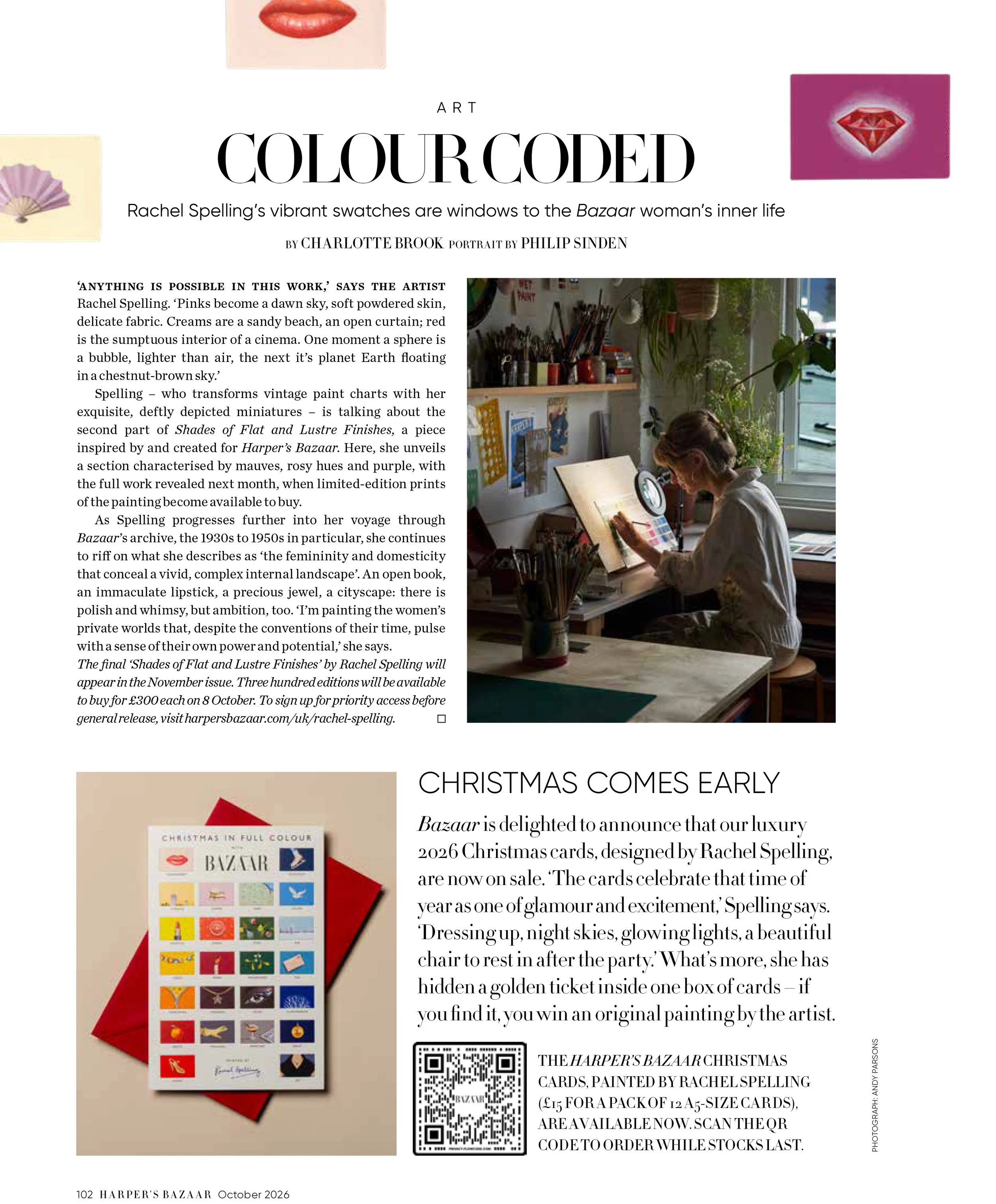
And here is the article which accompanied the section set of paintings, in the October issue. The brilliant photographer Philip Sinden spent a day in my studio back in June and it was fascinating to watch him work. His photographs have the most beautiful atmospheric light. Here I am at my desk, just acting natural!
In another exciting strand to this collaboration, I’ve also designed a Harper’s Bazaar x Studio Spelling Christmas card. The card has just gone on sale, with 12 huge, beautiful cards for £15. Click here to read more about the project. The cards are sold through the Harper’s Bazaar website, and the button below will take you straight there.