
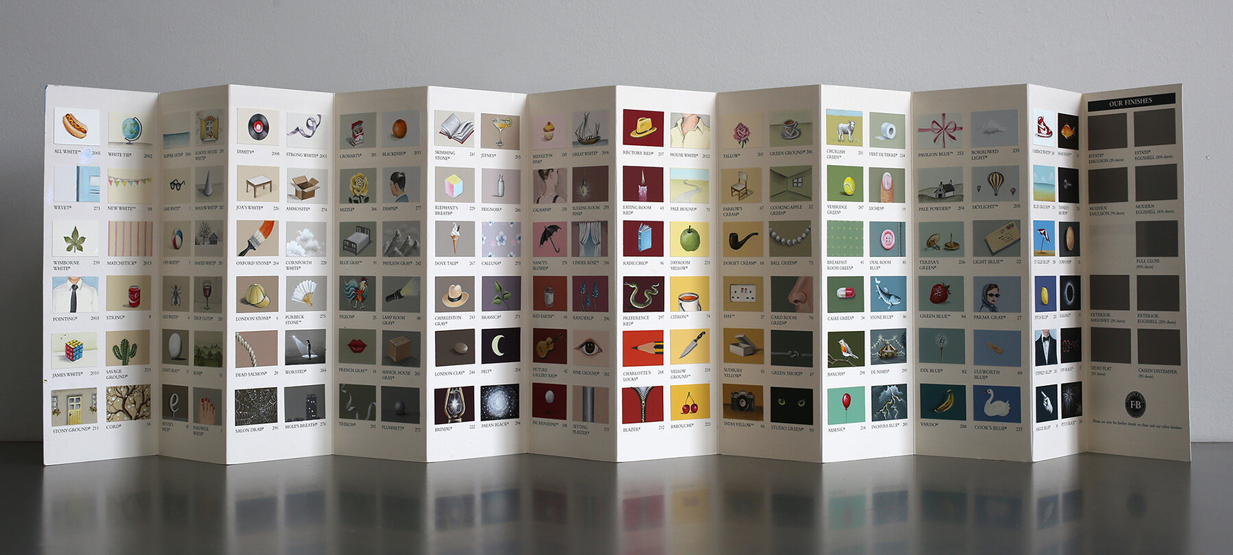
I didn’t plan to paint every single one of the 132 samples on the Farrow and Ball colour chart. But once I’d started, I just couldn’t stop!
There was something about the 2020 Covid-19 lockdown which made everything seem to shrink. Our homes became our whole world. Small things became very important. I had a lot of paint charts lying around (I really, really love paint charts) and one day I tried painting a fish on a Farrow and Ball blue. It was really enjoyable - it felt like painting a tiny mural, so it was kind of familiar but also completely new at the same time. I realised I was really enjoying myself, for the first time in a while! It was quiet work which I could do at the kitchen table and it couldn’t be cancelled due to Covid. So I painted a few more - a hat, an eye, an apple, a snake - and then I got completely carried away and painted the whole damn thing…

It took a very long time… I even started wearing glasses… I got so addicted to it that I worked right through the night a few times. It was literally all I wanted to do! My neck got strangely stiff. When I’d finished it I sat back and tried to figure out what it was. 132 mini murals. A tiny exhibition. A busy dream. A sketchbook. An ideas generator. A google image search. A colour workshop. A lockdown diary. A story board for a strange film. I’m still not really sure what it is or who it’s for, but I do know it seemed to strike a chord in lots of people. I put it on my instagram and was overwhelmed by the response. Suddenly I seemed to be in conversation with people from all over the world. It seemed to have a kind of power of its own. I just couldn’t believe it. For the first time I started to really understand the joys of social media!

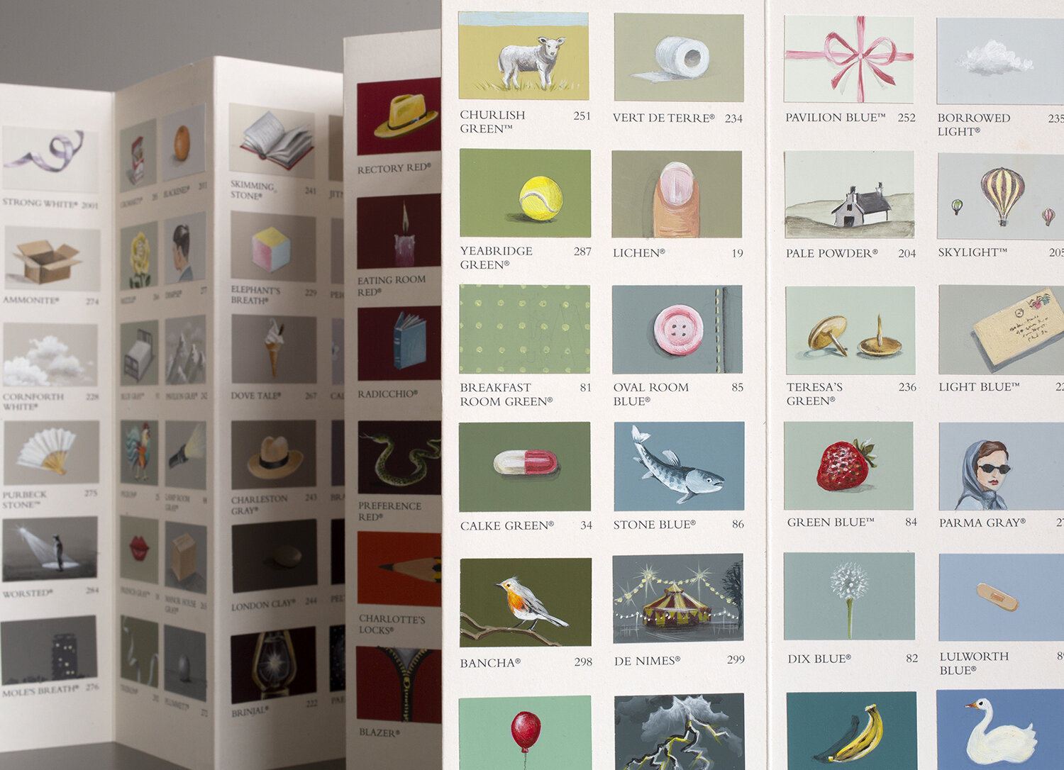
A lot of people asked me how I chose what to paint and I tried to figure out if I’d used a system. I hadn’t really - I’d worked very instinctively and I was so lost in the work that the ideas just seemed to come straight away. But I realised it did have quite a distinct atmosphere, so I tried to piece together what I’d done. There were a few things I’d been careful about. I’d made sure to mix up the scale, so sometimes a colour was a whole landscape and sometimes it was a close up on a piece of fruit or a button. This made it seem cinematic, and really freed me up to use lots of different references. I also consciously brought in some diagonals (I love a diagonal!). But apart from that I just gradually got a sense of the kind of things that worked. The objects needed to be quite plain and uncomplicated, generic examples of their category, a bit like the objects on an alphabet frieze - A is for apple, it just is! Sometimes the colour was really important for the content - so I’d paint a blue suit on Stiffkey Blue, or a cream blouse on House White, or a sea on Blue Ground - but other times it was just more about how the colour looked with another colour to create an effect. That was where I was on home turf, having painted so many murals on so many lovely Farrow and Ball colours. but I learnt a lot about new colours too - ones I wouldn’t have touched before. London Clay, for example - it’s a kind of murky brown, a bit retro. I’m sure my dad had a pair of trousers that colour in the 70s. But it’s AMAZING to paint on. I painted a stone on it, and it’s one of my favourites. It’s dark enough for white to really pop out, but light enough to use a black shadow. I’m hoping someone books a really gloomy mural soon so I can use it again!
One more thing - it would be wrong of me not to mention I was channelling René Magritte throughout, my favourite artist of all time. Midway through I realised the mismatch of the paint names to the images I was painting came straight out of surrealism and Magritte especially. So I added a Magritte pipe on Dorset Cream as a homage to the great man. I had a few other artists at the back of my head throughout but I shan’t list them, that would be boring, and it’s not really an Art for Art’s sake piece of work, it’s much more fun and open than that. It’s really just about colour, and the myriad ways colour affects our lives, our homes, our memories, our mood and actually our Covid lockdown too. Colour can really help when times are tough.

I made a two really short films about the colour chart. The first one is basically a 45 second colour party and the second one is to give you the feeling of holding the paint chart in your hand and casting your eye over it from beginning to end, with soothing music to replicate the dreamy headspace I was in the whole time I was painting it. I really miss it now that it’s finished. If you like the chart please share it and spread some colour, 2020’s been a bit grey and it needs a lick of paint!!
UPDATE: Prints of my painted colour chart are now available to buy and they’re very beautiful - have a look here!